Everyone is getting their commercials online in a mid West style Gold Rush. What’s the reason fort this? Simple: There’s gold in them there [digital] hills.
The number of online purchases is increasing at an exponential rate and many businesses are making the switch from online brochure site to full ecommerce activities allowing their clients to buy their goods and services at the click of a mouse button.
Where to start with an Ecommerce website?
The UK economy has to remain competitive and it’s important that the UK continues to develop on the growth of the ecommerce sector.
Jakob Nielsen (web design usability expert) argues that you need to focus a number of areas to create the best online experience, these include:
- Product Search
- Managing Relationships
- Helping during the Decision Making Process (DMP)
- Buying Process
Nielsen bases these on his research of consumer behaviour online and accordingly the website needs to have a set of tools that assist the e-shopper at every area.
How to approach your Ecommerce Website Categories
Building an ecommerce website is a bit like doing fractions, the first thing you have to do is work out the lowest common denominators, that is: what are the basic common themes and basic differences? For example if you are selling clothes you will have T-shirts, Jeans, Shoes however they can generally be drilled down to men’s and women’s clothing from which the categories can then be broken out.
How to approach Product Search on an Ecommerce Web Design
Let’s face it; the main way a consumer will search for a product is Google, that doesn’t guarantee that if a user finds your site they are going to naturally land on the product page or even be able to find the products when they get there so you’d better to be sure to put a nice big search box on there – personally I prefer them to be in the middle of the masthead similar to the way IKEA does it.
Your search should also give your users advanced search options- so it should have the ability to select certain categories, define price, colours etc.
Your search results should appear in catalogue format – so go down to the local Argos or Next and get one of their catalogues and see how the professional catalogues are laid out, offline is generally a good starting point for online in this case.
What should be included in the Category and Search results pages?
These should give a quick overview of the products in that search result or category. It’s important that it demonstrates that there are ranges of the products where applicable and encourages the web visitor to click through to the product page.
What should be included on an ecommerce products page?
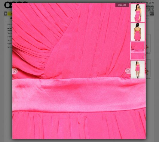
Remember the traditional catalogue, you need a big photo, multiple photos, product specifications, options and prices. Visitors should be able to zoom into photos – if you’re selling clothes then it’s important the visitor can see the weave etc just like they would if they were physically looking at the product in a normal shop.
Certain product pages should have multi media elements – such as videos of the products at work, this is important if you’re selling something like a web-based application.

Check out what your competitors are doing and consider what’s realistic with the time and resources you’ve got.
How to up-sell on an ecommerce website
Sometimes a product can be up-sold, that is you can add something to the product to create a product package in order to charge more money, think of a takeaway they sell you a meal and ask you if you want to go large – this is up-selling; for example you might be able to sell two products for only 50% extra.
How to cross sell on an ecommerce website
Cross selling is another important feature of an ecommerce website, cross selling means selling another product that compliments the product you are buying. For example you may have a product page displaying jeans, which would feature other products such as belts etc.

Cross selling and up selling need to be set up properly in your ecommerce software – if done properly this is a goldmine and will give you a lot of user data about the products that people buy.
How can I increase the sales from my website?
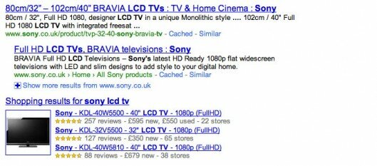
If you’ve done all the onsite work you think you need to do then you need to start integrating your products into other applications? Make sure your ecommerce website feeds out to Google Base – Google Base feeds Google product search, which often displays in regular Google searches.
How to Build Ecommerce Customer Loyalty
When dealing with the online environment it’s very important that you secure your consumer so they return over and over again – remember they are only one search away from finding your competitors, so you better be sure you’re giving them a great experience so that they want to come back time and time again.
In order to build up that relationship with customers make sure you answer all your customer questions especially those relating to online purchasing, listen to their feedback and act on it, it will help you improve your website. Secondly you should also provide as much information as possible, make it easy for your visitor to find the information they are going to be looking for, have FAQs, delivery info, T&Cs, size definitions etc – make it all really transparent, this will only add to your credibility and stimulate people to come back over and over again.
Make sure you are collecting as much data as possible about the way your users are using the website, the beauty of an ecommerce website is the user has to give you their data, so collect information about the way they navigate your site, or buy things from the site, this data can then be used to create newsletter and loyalty promotional schemes that target certain products to specific users.
How to deal with choice paralysis in an ecommerce design
Choice Paralysis is one of the biggest problems for an ecommerce website, basically you give the user so much information they can’t make a decision about which product to buy. The ecommerce web design should subtly funnel the visitor in the right direction; I like designers that use graphics that literally point, as long as it’s not too obvious I think it can work really effectively.
Don’t display too much on the page at the same time – I’d say 15 products in a category section is the max – maybe less, and control the parameters by which they display, they need to display like for like products and prices where ever possible.
Where there are different colours or sizes these should be displayed in the products pages rather than the categories or search results (although technically these are of course a separate product in the database structure).
Do I need a basket on my ecommerce website?
A shopping cart or basket is the one of a most fundamental elements of an ecommerce design it allows the user to quickly check out the products they have selected and how much they are due to spend, it also allows them to add multiples as well as remove products they’ve already selected at any stage in the process.
The shopping cart or basket can be make to look quite interesting – if you’re a builder merchant selling on line why not visualise the cart as a van or truck, if you’re a janitorial suppliers why not visualise the cart as a mop bucket?
Make sure you stand out – little elements such as these will keep people coming back to your site.
Which Payment Gateway should I use?
Associate your business with an established brand, display their logo on your website to add credibility to your site and reassure the visitor in the process. There are a number of payment systems you can use, I’d recommend integrating them with your website style and keeping your visitor on your site at all times.
Remember that mobile phones are a growth sector and you should be sure your payment gateway will accommodate mobile-commerce.
Ecommerce Designs should be different
Do your research, find out what the commonalities are between your competitors and take note of them.
Then be creative, only by being different will your website get anywhere, otherwise you are giving your visitors nothing they haven’t seen already and no good reason to return – internet marketing is just another kind of brand marketing, don’t let anyone tell you differently.


# June 14, 2010 at 10:38 am
RE: Do i need a basket on my ecommerce website?
From a UX point of view a basket or cart is what the end users are
familiar with, if you start coming up with “toolboxes” or “mop
buckets” then you are instantly placing visitors in a realm of
unfamiliarity.
When i want to buy something i know the normal process
is add to basket or add to cart and then i checkout, so i scan the
page for the action link or button i have to press to add to my
basket. If your on a janitorial site then you may completely overlook
“mop bucket” because you think its an item that is being sold online.
Think of it this way, you go into a store to shop and you ether put
your items in a shopping cart or a shopping basket where ever you go,
just because you go into B&Q doesn’t mean you all get given wheel
barrows to put your items in?
There is a balance between expressive creativity, and user experience, it’s always depends upon your site and your requirements, conversion driven sites would prefere to stray down the user experience path and keeping things to a proven platform at the price of subsided creativity to maximise profit, whilst others may choose to go down the creativity route to stand out from the crowd and be above the rest.
Some big websites and what the call there baskets/action buttons
Amazon – add to basket
Walmart – add to cart
Target – add to cart
Apple – add to basket
overstock – add to cart
dell – add to basket
Just my 2 pennies.
# June 14, 2010 at 10:54 am
I think you are right in that people do expect an amount of functionality from a shopping cart/basket area (note I still refer to this as a shopping cart or basket) displayed on each page.
That functionality could include:
Amount, Number of Items, Link to the payment process
I like the way they do it on this site, functionally it’s all as you would expect it, however the graphic is of a parcel, which fits in?
http://www.plus.de/de_index.html
There’s also some nice examples here: http://www.foxycart.com/ of how you can differentiate between products that are downloaded, shipped out or even subscription based products.